“People don’t care how much you know until they know how much you care” – Theodore Roosevelt
By now, you may have taken an online course and discovered the challenge of learning in a digital classroom: It’s not for the faint of heart. As a homeschooled kid, I took a lot of classes online and remember being disappointed with my learning experience because I felt isolated.
In a brick-and-mortar classroom, there is a teacher helping to answer your questions, but the software I was using at that time didn’t seem to care at all about my needs or questions. Clearly, the software was designed only to speak, not to listen. My attitude quickly became “Well, if the software doesn’t care about me, then why should I care about it?”
As digital education evolves and as the online student and teacher experiences become more important, new technology and product development roles are being introduced into the field. Last fall, I accepted a role as a User Interface/User Experience (UI/UX) Designer at StrongMind, an ed-tech company that creates award-winning digital curriculum/courseware for secondary schools.
If you’re asking, “U-I-U-What-Now?” you’re not alone. UI/UX Design is a relatively new field, and my role is a mystery even to my parents. Essentially, we design what the online classroom will look and feel like based on our users’ goals, needs and motivations.
Each day, we do our best to advocate on behalf of all users—students, teachers, parents and administrators—and we look for ways to improve the product experience to surpass their expectations and delight them. To do this effectively, we must dig deeper into our users’ goals and learn about their working relationship with our online classroom. For example, a student goal might be to submit homework on time. With that goal in mind, we ask ourselves, “How can we make that process easier and faster for users with this goal?”

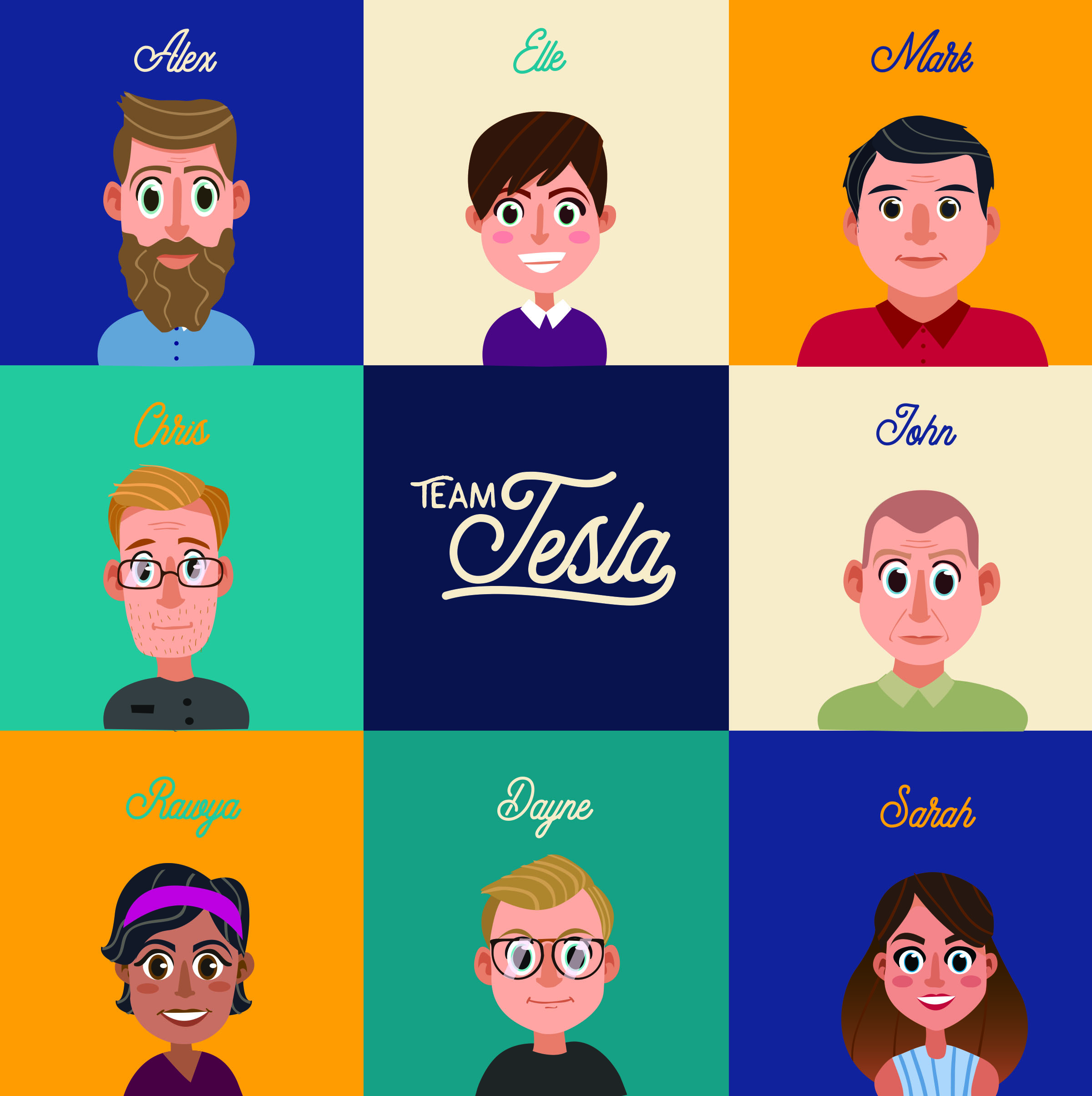
An illustration I made of the product development team I work on that is responsible for improving StrongMind’s LMS.
When I began working as a UI/UX Designer at StrongMind, I was tasked with redesigning its Learning Management System (LMS) and finding opportunities for usability improvements. I hoped to use my personal experience with taking online classes to help students learn more effectively in the digital space.
In my first week at StrongMind, I noticed that the backlog —our “to-do” list— of LMS redesign requests was quite long. To help prioritize our work, we collaborated with the user research team to conduct user studies on our product. We conducted face-to-face and remote interviews, observations in our research lab, and several rounds of online surveys. We also studied data from messaging/analytics software embedded into our application.
Data gathered from these research methods improves our understanding of the students and teachers using our platform and informs the products we build for them.
At first, I assumed most of our research participants would be students, but it became obvious that teachers were the real power users. We learned that certain features can save them significant amounts of time that they can reallocate to teaching.
The research we conduct gives us an intrinsic understanding of what both teachers and students struggle with, what they want to see improved, and what they expect from our product. Observing the students and teachers interact with my prototyped designs made me eager to start the design phase.

A Likert-like Scale I created to help the user research team determine desirability of a product.
Although I was in the correct mindset to begin solutioning right away, I waited until all of the user research was collected before delving into design. Empathy is my greatest strength as a designer, and it helps me design usability solutions from the users’ perspective. Having the users’ feedback front-of-mind allows me to design through their lens and streamline their daily activities.
The user research, LMS research and company branding guidelines all influence how the final product will look and feel.

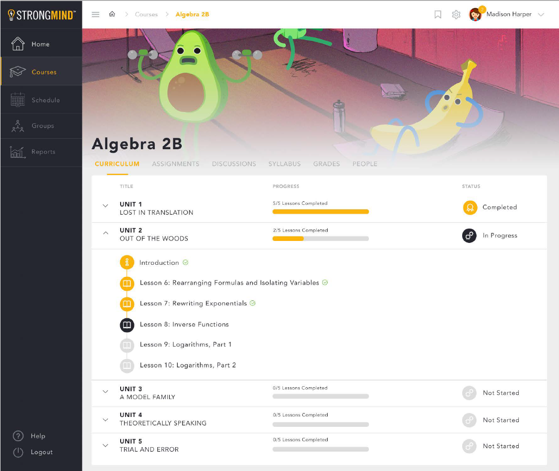
An initial concept design for the StrongMind LMS.
Designers don’t just create the visual and aesthetic elements; we also design interactions. For instance, identifying how a student will interact in the online course is just as important as the course itself.
Learn how we develop our curriculum in our our interactive white paper on backward design.
I create userflows to develop out the information architecture and make the LMS easier to navigate. Additionally, I define how each element in the product will respond when a user clicks it; I do this to ensure the result matches the user’s expectations.
As the engineers bring my designs to life, I act as the voice of the user and help to inform the implemented changes with user data and research. I also ensure the design is being implemented correctly. While the engineers code, I collaborate closely with them to ensure a pixel-perfect user interface.
This summer, we launched the newly redesigned LMS for our users. It’s been an educational experience (no pun intended) and has taught me a lot about the goals of product design in the online education space.
People are my biggest motivation. I hope what I design improves the lives of the teachers and students by humanizing their online learning experience.
Users are constantly evolving, and their goals change. Therefore, we will continuously work to adapt StrongMind products to their ever-changing needs. As we continue to help improve learning and teaching outcomes, my team and I aim to create an increasingly delightful experience for teachers and students that demonstrates how much we really do care.
To see how StrongMind can help your school engage students for a more enjoyable learning experience and improved academic outcomes, request a personalized demo today.
 Sarah is a progressive UI/UX designer from Arizona. Over the years, she has shared her passion for innovative, user-focused design and products with several companies, nonprofits, and start-ups alike. She once took a selfie with Joss Whedon in line at San Diego Comicon.


Cool. Nice work Sarah.
The background with what looks to be an avocado lifting weights and a banana doing crunches made me laugh out loud. I enjoy the whimsy there.